Measuring perceived usability after many development steps - an evaluation of Aiming.Pro and it’s features
Aiming.Pro has undergone many developmental steps since launch; making it into a feature-packed platform for all competitive first person shooter aim training needs. With such developmental advances, the usability of the application comes into question. Has it become too advanced for users to understand? Has it become an expert-only product? Do new users have a chance navigating the feature landscape? These questions are what this evaluation sets out to explore.
Project Overview
I conducted a usability evaluation of Aiming.Pro, an online platform for precision shooting training. The platform offers drills, performance tracking, and training customisation. Recent feature growth and layout changes prompted the need to assess whether usability remains high for both new and experienced users. My aim was to measure perceived usability, identify friction points, and recommend improvements that maintain efficiency for experts while improving onboarding for new users.
Research Objectives
The evaluation set out to determine:
How perceived usability differs between experienced and new users.
Which interface elements support efficiency and ease of use.
Where users encounter friction, confusion, or inefficiency.
How onboarding and navigation could be improved without disrupting expert workflows.
Methodology
The evaluation was based on the System Usability Scale (SUS) to gather quantitative benchmarks alongside qualitative feedback.
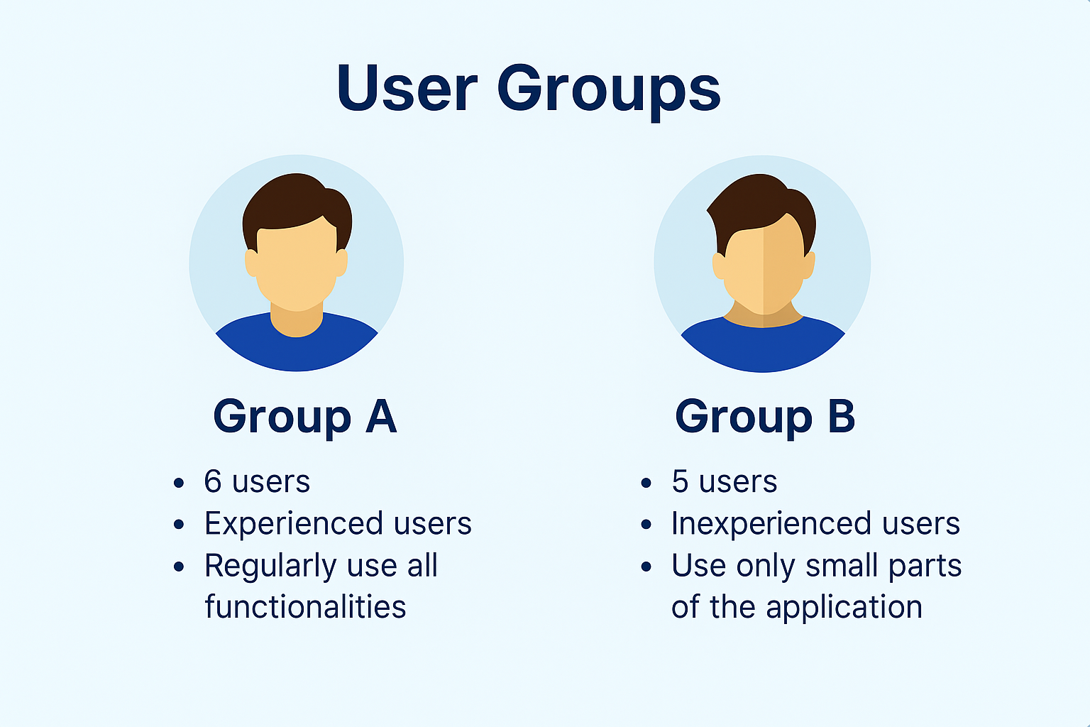
11 participants were recruited for the study, divided into two groups as seen in the graphic below:
As mentioned previously, the groups were separated to capture the perceived usability at both extremes of users. While including an intermediary group could have offered a fuller picture of the application’s perceived usability, it was beyond the evaluation’s scope.
Both groups completed the same tasks:
Navigating to and using the Drill Creator to set up a specific drill, editing it, and finally deleting it
Accessing performance analytics for previous drills.
Applying filters to compare historical scores.
After each session, participants completed the SUS questionnaire and shared comments on their experience. Observations during task completion were noted to capture hesitation, errors, and workarounds.
Key Findings
Usability gap between groups
Group A: average SUS score 84.6 (A+ rating, top percentile).
Group B: average SUS score 48.5 (F rating, lowest percentile).
The gap highlighted that while the interface performs very well for experienced users, new users face significant learnability barriers.
Strengths for experienced users
Group A praised the Drill Creator’s flexibility and speed. One participant described it as “effectively making the creation of a complex scenario simple.” They navigated tasks efficiently with minimal hesitation, often skipping intermediary steps because they knew where functions were located.
Barriers for new users
Group B struggled with discovering key features. One participant said, “I would not have known how to create a drill without instructions.”
Others missed relevant navigation paths entirely, relying on trial and error. Several pointed out inconsistencies, such as settings being located in unexpected places, with one noting that “icons don’t always match what they do.”
Workflow inefficiencies
Both groups mentioned that adding drills to playlists required returning to the drills page, which interrupted their flow. While experienced users saw this as a mild annoyance, new users found it compounded their navigation struggles.
Synthesis
I triangulated findings from:
SUS scores for measurable benchmarks.
Task observations showing where hesitation and backtracking occurred.
Participant comments explaining why those points were challenging or satisfying.
Heuristic mapping that identified inconsistencies in standards, poor visibility of system status, and lack of user control in certain workflows.
This confirmed the core challenge: excellent efficiency for experienced users, but steep onboarding friction for new users.
Outcome and Impact
I recommended:
Onboarding improvements: contextual tooltips in the Drill Creator and guided first-use flows for key features.
Navigation streamlining: enable adding drills to playlists from the playlist page to reduce unnecessary steps.
UI consistency checks: align iconography and labels with standard patterns.
Further diagnostic research: use think-aloud testing to pinpoint where and why new users miss navigation opportunities. This would additionally allow for more in-depth data and context behind the comments left by participants.
These recommendations aim to preserve the high performance experienced users enjoy, while removing barriers for new users, as well as provide direction for further research initiatives.